Showing posts with label How to use clip art. Show all posts

Tuesday, October 26, 2021

Narrow Halloween Frame


Description of Illustration: This frame is very narrow and well suited to a newsletter of sorts., witch, cat, broom, old house, night sky, big moon, The witch is chasing her cat, cat food, place for text, superimpose your own text, poem, dates for party or ''trick or trunk'' frightened cat, Click directly on the frame to download the largest available size.

Have a question about the illustration? Just type it in the comment box and I'll get back to you as soon as possible. I only publish content that is closely related to the subject folks.

Monday, September 20, 2021

A Friendly Ghost Frame

        A graphic frame is designed to contain text; it surrounds text and most usually gives a clue to the reader as to what the text is about before they read it. The sample Halloween ghost frame below was used to advertise an old-fashioned ice cream social within the context of a Halloween event. It was used by a Congregational church over 70 years ago.

Left, original church event. Right, printed on orange paper.

       Next to the original ad is an example of what the frame would look like if printed on orange paper. This is an economical way to get color into your printing without spending much money for expensive color inks. Your congregation is free to use the friendly little ghost frame below to advertise their own "trick or trunk", Halloween party or costume contest. Just pull the ghost into Photo Shop or some other similar software program and type in your own text.

This friendly ghost frame comes in greyscale only.

Have a question about the illustration? Just type it in the comment box and I'll get back to you as soon as possible. I only publish content that is closely related to the subject, folks.


Wednesday, March 1, 2017

Colors As Emblems by E. Goldsmith

Tree of Jesse detail from Reims Cathedral.
       In early art colors were always used symbolically, and until the old traditions were cast aside by later painters, certain colors were always associated with certain subjects and certain personages. In all the old stained glass these rules were scrupulously followed.
  • White was the symbol of light, faith, joy, life, and of religious purity, virginity, and innocence. It signified honor and integrity in the judge, humility in the rich man, and chastity in a woman. Christ appears in white after His resurrection and the Virgin wears it in pictures of the assumption.
  • Red, the ruby, denoted fire, divine love, the Holy Spirit; royalty, creative power, and heat. Red and white roses are symbols of love and innocence, or love and wisdom. Thus the angel crowns St. Cecilia. Used in the bad sense, red typified blood, hatred, war. Red and white together were the colors of the devil and of purgatory.
  • Blue, that of the sapphire, signified heaven, fidelity, constancy, truth. Christ and the Virgin wear the blue mantle typifying heavenly love and heavenly truth. St. John the Evangelist was given the blue tunic and the red mantle.
  • Yellow or Gold was the symbol of the sun, of the goodness of God, of marriage and fruitfulness. St. Joseph wears yellow, and St. Peter, in pictures of the apostles, wears a yellow mantle over a blue tunic. Used in the reverse sense, yellow denoted jealousy, deceit, and inconstancy. The traitor Judas wears a dirty, dingy yellow.
  • Green, the emerald, the color of spring, symbolized victory and hope - particularly hope of immortality. 
  • Violet, the amethyst, signified passion and suffering, or love and truth. It is the color worn by the martyrs, by the Virgin after the crucifixion, by Mary Magdalene as the penitent, and sometimes by Christ after the resurrection.
  • Grey is the color of humility, mourning, penance, and accused innocence.
  • Black indicated darkness, wickedness, death, and mourning, and was given to Satan. Black and white signified humiliation or mourning, and purity of life, and for this reason was adopted by the Dominicans and Carmelites.

Saturday, August 1, 2015

The Sanctuary Is Reserved.

This is the older version of
bridal clip art. The font is very
traditional.
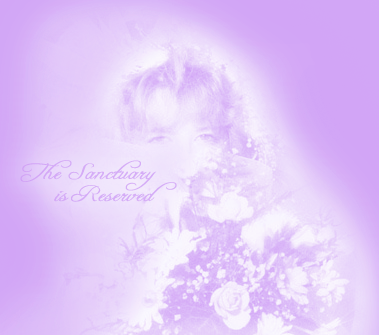
Description of Photograph: Photo of me holding my bridal bouquet over twenty-five years ago. Wow, time sure has passed. I'm still happily married to the same fellow. He and I have been through it all!

Clergy may download and use this photograph to announce weddings and rehearsals in their bulletins, email, web pages, newsletters etc... 

Have a question about the illustration? Just type it in the comment box and I'll get back to you as soon as possible. I only publish content that is closely related to the subject folks.

Here I've played around with the font a bit, and changed it to green.
I then decided to change the positioning of the font altogether and also have included six new monochromatic versions of the photograph; these seem to blend in with some web pages better. The three new colors are common to Spring weddings: pink, blue and lavender.

You can see here that I've moved the text to the left
and have selected a bolder looking one.
The two monochromatic blue versions. One has a very fine border
around it and is intended for white backgrounds only.

Here, as with the blue and lavender versions, the pink is also available
with a darker background. I prefer the lighter backgrounds but my daughters
have informed me that boarders in graphics are not as fashionable.
I have argued with them about the visual necessity of them but to no avail.

Lavender in weddings apparently is quite popular, so I was not allowed
to avoid it here. My oldest child says that it is necessary; so there you have it.

And at last, because it was requested by a clergymen, a grayscale for newsprint.

Thursday, March 26, 2015

Include Initial Letters in Your Next Publishing Project

One of many lovely initials from the Middle Ages,
restored for contemporary use.
OW consider illustrating a bulletin or newsletter with Medieval, initial letters. There are many resources for initial letters on the internet. I will include a couple of free samples from my new collection below for visitors to use in their hard copy publications and a listing of additional collections on the web at the end of this post.
      The classical tradition, according to Wikipedia, was late to use capital letters for initials at all; in surviving Roman texts it often is difficult even to separate the words as spacing was not used either. In the Late Antique period both came into common use in Italy, the initials usually were set in the left margin (as in the third example below), as though to cut them off from the rest of the text, and about twice as tall as the other letters. The radical innovation of insular manuscripts was to make initials much larger, not indented, and for the letters immediately following the initial also to be larger, but diminishing in size (called the "diminuendo" effect, after the musical notation). Subsequently they became larger still, coloured, and penetrated farther and farther into the rest of the text, until the whole page might be taken over. The decoration of insular initials, especially large ones, was generally abstract and geometrical, or featured animals in patterns. Historiated initials were an Insular invention, but did not come into their own until the later developments of Ottonian art, Anglo-Saxon art, and the Romanesque style in particular. After this period, in Gothic art large paintings of scenes tended to go in rectangular framed spaces, and the initial, although often still historiated, tended to become smaller again.
      In the very early history of printing the typesetters would leave blank the necessary space, so that the initials could be added later by a scribe or miniature painter. Later initials were printed using separate blocks in woodcut or metalcut techniques.

   "For a century after the invention of printing, (Johannes Gutenberg, 1439) the art of illuminating made steady progress; but from that time it began gradually to decline, anrated in chd although it still existed so late as the seventeenth century, it was rarely practiced, and almost wholly confined to religious and heraldic  books. The discovery of engraving on wood having quickly followed that of printing, the drawings of the time were copied and multiplied by this cheaper process. The progress, also, of the reformation, and other religious and political causes, having at the same time combined to withdraw from Art the patronage it had received in most of the countries of Europe for so many ages, the fashion of illustrating books dwindled in frequency, degenearacter, and ultimately ceased altogether." Henry Shaw

Here you can see three examples of initial letters used to decorate a page from an illuminated manuscript, a book describing the history and practice of using initial letters and also a page from an illuminated hymnal.
Initial Letter "A" from my new collections.
This letter was drawn by Albert Durer in 1499
Initial Letter "F" from my new collections

Description of Illustration: initial letters "F", "A" and "N" in color

Watch this professional calligrapher craft an initial letter,"F."
Have a question about the illustration? Just type it in the comment box and I'll get back to you as soon as possible. I only publish content that is closely related to the subject folks.